Blog comment #5

https://msmonoxide.wordpress.com/2018/03/08/playtesting/

Greetings for the # time today.

Your blogpost is very easy to grasp and provides a lot of general information. My issue with the whole post is that it’s a bit too general with it information.

I liked that you told us about how you did perform the playtest and what you thought of to make sure it wasn’t tampered with, it would have been nice to hear about what questions you asked during the playtest.

That is the general feel of this entire post, it feels like it lacks something because I was left asking what you did to solve these issues  and once again what questions you asked. The reflection on why playtesting is needed and something good that is apparent through your whole post is something that’s great to keep in the back of your mind all the time.

I mentioned earlier that it was easy to grasp in the way that it’s written. There is however some minor grammatical mistakes, so i recommend rereading the text or putting it through a spellcheck, because it’s structured correctly, it’s just some parts that become a bit messy.

Good luck on you future endeavors!

— Carl

Blog comment #6 Roberto

https://robertouublog.wordpress.com/2018/03/15/insight-6-behemoth-postmortem/comment-page-1/#comment-9

Good afternoon Roberto. This seems like a good reflection on the development of the game.

The way that it’s set up with a quick overview of the project and what it contained is good and provides context to the rest of the blog post, and also serves as a good reminder. The good and bad parts are well structured and it feels like you’ve gained something from it.

There’s not a lot of things that’s wrong with your blog post, but I’ll try and “nitpick” a little.

I would have loved some more talk about your mechanics and how that went well, like how did you fix the reload function? It would also have been good to hear more about how you designed the tutorial. I could make a joke about show don’t and don’t tell, but as I said, nitpicking.

The last paragraph was a very sweet thing to do.

I hope that your next project goes well and that you remember and use everything you’ve learnt about this project.

— Carl Leong


Time to dissect a fresh corpse: Aetherial Post Mortem

With the 2D shooter game finally done it’s time to dissect it’s still warm corpse and see what I’ve learned during this project. There’s a lot of things I’ve learned so I’m just gonna mention some of the bigger ones and the things that really stand out.

First of all, let’s talk about the outcome of the game. During the final playtest we had a lot of people play our game and the vast majority seemed to be enjoying themselves. We didn’t get any harsh critique directed at the gameplay itself, except that we missed to give enemies some form of feedback when they’ve been hit. An actually fairly major thing. All in all however I’m decently satisfied with the project as a whole. I do however think that the game could have been a lot better if we as a team playtested the game more earlier on.

I’m myself would also have liked to have more animations for the ship and enemies, something that slipped partly because time-constraints and partly because we overscoped mixed with the fact that this was my first time working with animations. I’m also discontent with the sound effects in some places but that’s a whole other discussion.

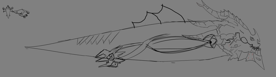
Animations are time-consuming and they’re difficult: As most artist probably know at this point: Animations takes a lot of time to finish, even shorter ones where you’ve cut corners still takes a lot of time. Which coupled with the fact that they are hard to produce so that they look really good means that they take a lot of planning and a lot of time. Two things I didn’t always have or do. I did however become better at it during the weeks working on this. From needing around 12 hours to do a bad animation of a flying slug flapping its wing, to 2 ½ weeks for doing 2 decent animations and colouring them, to around 6 hours to do some better wing flapping, tail movement and some additional effects. It’s a brick wall that you just have to keep banging your head against it seems. For the coming project (and I don’t know how many times I’ve written this) I’ll try to sketch out the animation beforehand as well as do some more planning. On a side note, animating in frame animations is a lot easier than in the timeline, but also produces some wonky things from time to time. On this topic, consistency is hard to keep through a whole project, especially when you’re constantly learning new methods and ways of working and when you have people with different levels of expertise and schooling.

Animations might be hard, working together is harder: Being stuck with a group you didn’t choose where there’s some discrepancies in knowledge and motivation can be hard. Working together in the same group can be a nightmare. There’s a lot of group specific things that I could talk about. The valuable lessons I’ve learned doesn’t require that so I’ll spare you.

  • Be open (about what you wanna do) and where your ambitions lie. This is so important so that you yourself don’t have an illusion about how much work the other members will do. It’s also really important to get to know one another quickly so that you can be honest and also ask for help when you need it.
  • Fights and problem will erupt and as far as I’ve experienced it’s better to deal with any issue immediately rather than to wait for it to become a bigger issue.
  • Do bonding exercises. Hang out together. Pretend it’s an RPG and you need to max out your social links. Make sure that you can build some trust and camaraderie with your teammates.

All of these are to me important factors when it comes to making sure that the group functions together and works towards a common goal since you eliminate problems early on in their lifespans as well as making everyone a bit more comfortable with one another.

This also helps to create a common-ground for expressing yourself and communicating with one another. Not speaking the same “language” was a huge issue for our team, especially in the beginning. This is something I really want to make sure doesn’t happen on the same scale again.

As an end, I would just like to remind myself (and everyone else) that playtesting is super super important, even if you are on a really tight schedule.

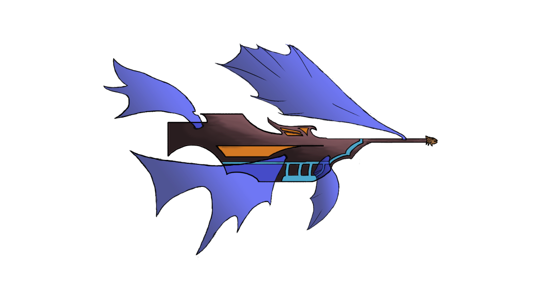
Our Frankenstein (game)

From the concept document we only kept the general ideas about what enemies to face, the standard shooting function and the restrictive aiming angle of the player character (the ship). We added a multi-shot power up, a laser and redesigned most of the enemies for simplicity’s sake. Like making the basic enemy just fire a projectile instead of circling you and firing projectiles. Doing these changes allowed us to focus more on other things for code, art and design since we had less restrictive and time consuming work.

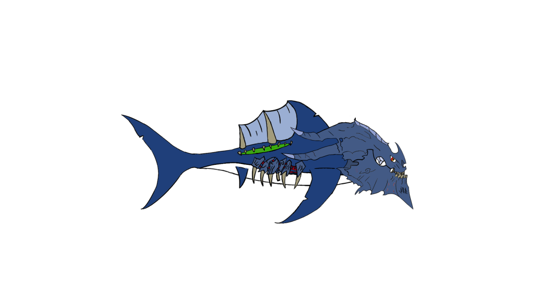
The game itself ended up being a single long level which started in a tutorial area and ended in a boss fight. Our tutorial taught players about all the mechanics of our game and led into the level. The level itself had multiple backgrounds which correlated to the difficulty of the waves of enemies coming at you, with the difficulty increasing as the sky got darker. The boss in the end had three attacks; one that focused on horizontal movement, one that focused on pattern recognition and the last was about prediction.

Because of our insane and lovable programmer we also had a difficulty select in our game, which governed the health, damage and projectile speed of all enemies. This difficulty select was great for a couple of reasons. First of all it allowed everyone who played it to choose their own experience and secondly it allowed us, as developers to create a game where we could be challenged without making the game unplayable for anyone else.

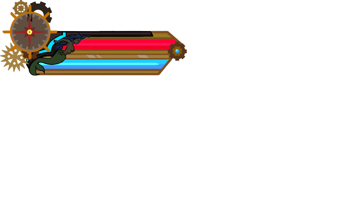
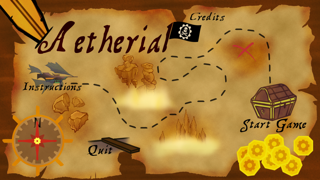
We kept the name Aetherial since we couldn’t come up with anything better. We sat during the last few days of the project, spitballing names until we realised that we’d fallen for Aetherial and nothing really could replace it.

Bag it and tag it: Final thoughts (update)

As for the end-product itself, the game, I’m (in retrospect now) decently happy with it. It has fantastic music that really sets you in the mood to play the game, with it’s adventurous sound. The gameplay itself is also tight. With the different mechanics and the responsive movement, the game feels like the beginning to what could be considered a decent enough shoot-em up, if fully developed and released. The visuals do feel cohesive for the majority of the time – the menus are in a bit of a different style, same with the background objects. That is however, not very noticeable since a lot of art is reused between me and the other one who helped. I’m personally a bit disappointed with the boss – it worked, was difficult and gathered success amongst the players, I still feel however, that it’s lacking both visually and mechanically, something that in the future can be fixed by making more sketches earlier if a boss is on the table.

In the end I don’t have much to say about the game. We finished it 2 months ago and the lasting impression I got from the project is a feeling of proudness. We made a very classical and solid 2D shoot-em up with some decent visuals and amazing sound. Our designer made an amazing tutorial, only hampered by the team and a decent difficulty curve on top of that.

Every active team-member contributed to create a game that was good, even if it became stressful at times.

If anyone wants to see and play the game it can be found here https://drive.google.com/open?id=1VTRTh8AIFW6Mx7Lb39wm541SfNAvl9BN


To test or detest? That is the question

Hello everyone, this will probably a slightly shorter blog post since it’s about how my workflow and priorities has been affected by the feedback gained through the playtesting. Throughout the playtesting we got very few comments on the art in general, and most of what we got was that it looked good – there are however two artistic things that have found their way into the game faster because of the feedback we got.

Well technically 3; During the alpha we got comments on the powerup being hard to identify and that the background felt weird and during the beta playtest I got into a discussion about the (lack of) sprite for the ships laser.

First of all, the powerup was interpreted as something dangerous even though it was a blue happy little ball – to solve this and to make it look friendlier I added some glow to it, since that is often associated with things being friendly and positive unless obviously bad. This was also something that had been a total oversight on my part since we never planned to revisit this the same way as the following objects.

Animation-for-powerupAnimation-for-powerup-Recovered.gif

The background was something I made as test and didn’t have time to figure out how to do it better in the style we talked about in the team. We got some comments on it being distracting and blurry, so we decided to redo it for a couple of reasons; 1. To make it look better. 2. So that it’s less distractive. 3. Because a miscommunication between me and the programmer on the topic of parallax.

Background 2 wip smudged

Background for first enemies.png

The new background, looks a lot better and is easier to work with for obvious reasons. It is however less distinct which is a minus – but you know, in the interest of time – kill your not-so-loved ones.

For the beta playtest we didn’t have a laser sprite. I created the ship during the first sprint and since then we sort of forgot about it. The complaint around our laser is that it didn’t feel powerful enough since it was semi-transparent bar with a few round particle effects – which made it feel very weak compared to what it should be doing. So after discussing it with the person giving us the feedback I quickly sketched a design on the whiteboard. To give it a powerful aggressive feel I wanted it to be moving, and sissling with power. As well as spiky to further emphasise the aforementioned feeling.

Laser

As I said, all in all we didn’t get a whole lot of feedback regarding the art – part of that might be that we never asked for feedback regarding how our game looked, and most of the few things we got was just stating that they thought it looked good, which is nice for ones ego, doesn’t help a lot with further developing the product.

Blog comment #1 Ellen

https://buriburifarm.wordpress.com/2018/02/08/official-post-1-pixel-art/

It’s a very concrete introduction to pixel art.
The reasoning for why you chose to do pixel art is easy to follow and has real thought put into it. The section might be little short, but since it’s clear why you chose to this style, coupled with an evaluation of risk further down the text I don’t think there really needs to be more of an explenation.

A bit more risk assessment could have been nice to see – discussing where the pitfalls might lie, how you would avoid them and how you would deal with them if they arose. Above this, you did however mention the rules which you and Benjamin had decided upon. Which explains both in how you would minimize risk and shows some excellent planning.

The rules along with the links you’ve provided gives me a pretty clear idea on how you’ve decided to create your assets, it would have been nice to hear about how you did it and what challenges you overcame as you were doing it.

You’re nice introduction was really helpful in getting to know a little of you and your style/infuences, as well as telling me what game you’re creating. On that note it would have been nice to know the purpose of the fish and your intetions with it.

All in all I think the post is great, it gave insight into your process as well as providing links to what you’ve used. Which is great both because it allows me to get a greater understanding of pixel art and a generally good link to have somewhere. I also liked the small personal touches in the post.

Great job, keep it up!

Blog comment #4 johan

https://fallberggraphics.wordpress.com/2018/02/28/blog-4-sound-introduction/comment-page-1/#comment-13

Greetings Johan.

This blogpost has huge thing going for it – and that is that it’s a really great introduction. I quickly get an overview of what programs you’ve been using, why and how you’ve been using them, without bogging me down with too much details. It is however also those details I’m missing. You mentioned that this week has been your introduction to these programs , have the process of getting used to them gone smoothly? Have there been any hiccups?

You mention creating sounds and I can hear (no pun intended) that you’ve thought about why are using the sounds and filters you’ve chosen to use. I wish you could have posted some of the sounds you’ve been making, with and without the filters. This would give me a better a idea of what you’ve been doing and how your design decisions work practically. I also think that this would make write more about them, which I think would be really informative and fun to hear.

Your language is good and they way you write is enjoyable and I can’t really find anything wrong with it.

Great job Johan and thank you for giving us a quick rundown of these programs.

– Carl Leong

Cobbling things like a carpenter – or reusing assets

As we are heading into the final sprints I’m sure we all have noticed the need for polish and just the feelings that we don’t have enough time to finish everything we want to do. Well my team definitely noticed this, and after trimming and cutting some content we were left with a list of things that needed to be done until release. Then we took that list and looked at what could be done with the help of old assets.

We choose to reuse art assets that had already been made for a couple of reasons. For one, because of cut content we had some pieces of art that hadn’t been used yet, so we choose to repurpose them. Two, is because it’s more efficient to take something old or unused and repurpose it. Especially if it already fits the game, and we were running out of time. Three, I can’t remember where I heard it, but you should strive to make sure that everything you create can be used more than once.

The biggest thing we had left to finish for the game was the boss. Which we had very little for the start of the week. The things we had was basically a sketch and some ideas for attacks. Now, 2 days later the boss was basically finished in both visual and gameplay design, this largely because I had unused art assets that easily could be repurposed.

The first thing I had was the sketch for the original boss idea. Where the head was the only thing that had really been developed.

Leviathan.png

I really liked the very aggressive look of the head, and it was already set up in individual pieces to help with animating it. So I decided to keep that. However I needed to make it smaller since it made more sense for the attacks our designer and programmer had made – after a bit of back and forth between ideas, the form landed on a shark.

MiniBossBOss - final.png

This, which is the version we’ll use in the game has the base of a white shark, with a slightly larger fin on the back. I’m decently satisfied with the design. It has the feel of an aggressive, slightly otherworldly shark, with a head of a dragon. The colours I choose for the body are mainly based around what the other creatures in the game has, and the armor is made with another shade of the same colour to make it look more like bone. The additional details on the body are mainly to bring a bit more cohesiveness to between the head and the body and also to create some purely visual tells for the boss’ attacks.

For one of the bosses attacks, we decided to repurpose one unused sprite, cut because it was originally part of our narrative, to be used for the projectile. So it went from what was supposed to be an egg

green crystal.png

To this, which is a projectile that will be shot sideways.

Crystal sideways.png

One of our enemies needed to a proper projectile sprite. The projectile also had exploding properties, and we were unsure on the best way to go about it. Would we use the same sprite but smaller or create a new one? Our solution came like a flash of lightning and we decided to use the projectile from the first enemy to create a recognisable threat and to have it be more streamlined visually – aka. less things new things to register in the players mind.

Slime_Gif.gif


A2LOA}S9JO0]@6%`3VF{G43.png


My project manager who helps me with the art has also repurposed a lot of the art in the GUI to help further our visual identity and to create a good base for it.

GUI_2.pngHere she took the front of our ship and used it for the health/aether bar.

Ship sketch actual colour-updated.png


A lot more has also been used in our various menus.

Main Menu 1.png

Reusing old assets sometimes feels a little cheap since you’re not creating it from scratch so it doesn’t feel as though you’re working as hard. It is however more efficient as I’ve said and it really reduces a lot of stress when you don’t have to create something new for everything that you’re doing. And I mean, hey, even Disney are doing it.

Week 3 feedback

https://felixrahmvideogameblog.wordpress.com/2018/02/25/thoughts-on-scrum-and-the-troubles-of-individuals-meeting-up-in-person/comment-page-1/#comment-11

Good afternoon, or whenever Felix. This was quite the intro perspective read. How you described the general work process of your group and your own workflow was all very easy to digest. Your description of the group dynamic gave me a good overview of your relation to one another and the project – without going into too much details.


I think that you like many other (me included) don’t have a real good grasp of how SCRUM works, which makes it hard to write in depth about what you’re doing. The content of it is a good reflection of the group work, that once again, just gives a good insight into your group from your perspective. The language is also really good, it was very easy to read. The structure is very sound, simply going from week 1 until now. Your style of writing (“Calm as a cucumber” specifically) makes it a joy to read.


I don’t have a lot to say and excuse me for the repetition. It’s good a post, don’t know how it will fare when it comes to the grading, but sadly I can’t give you much feedback for that.


Good luck for the future and continue to work hard Felix


  • Carl Leong

Feedback 2: Marie

https://mariecolingotland.wordpress.com/2018/02/15/sprint-4-polishing-the-harbor-and-player-boat/

Right off the bat – It’s very clear what’s been done here. A simple, but effective explanation of what you’ve been doing this sprint. The explanation of the function of the harbor is also really good. It catches me (the reader) up to speed without much excessivnes.

Your description of how you achieved this is also simple, it once again explains what you did and how you achieved that state, but nothing about the process itself. I think that this ties into the problem that you never mention or thoroughly explain why you made the choices you’ve made. Why is it more aesthetically pleasing to see the vendors? Why should there be more boats? Why can’t the bay be barren and empty? How does this reflect the feelings you’re trying to give the players? The same goes for the colours, what’s the thought behind them?

Your reflections on the boat however shows a lot of good things. It shows me the thought process behind some of the iterations of the player avatar. It also is a good reflection about the dangers, and ultimately the price of poor communication within the team. Having that sort of insight on how it affects you and knowing what the problem is has great value when it comes to advancing. I also like how you designed the boat and the harbor to fit together hollistically.

All in all I think that the post is good. The first part about the harbor is defenietly weaker than the one about the boat. And I understand, sometimes we just make things without really thinking about them – for the next blog post where we get to choose the topic I would ask you to focus a bit more on what you thought when you made your designs. I think that would make the post more valuable as whole, and not just parts of it.

On a sidenote, the art is great. Great job!

– Carl Leong

Feedback week 2: Yinsong

https://yinsongflytrap.wordpress.com/2018/02/14/making-the-sprite-shark/

Hello Yinsong. The blogpost was very easy to digest which is nice.
The step-by-step walkthrough of your design decisions and workflow makes everything super clear and it’s actually pretty inspiring to read about. Showing the pictures also really helps me to visualise what you’ve been designing.

Something I would have liked to see more of would have to be reference picture so where you have taken your inspiration from and kind of what you’re aiming for. I also noticed that the text isn’t as long as it should be, and to be fair, with how clear everything is I don’t really think you need to write anything more, since you’ve pretty much covered everything I can think of in the text. Especially the paragraph by the end about why you chose the left shark is a really nice touch since it shows that you (and your group by extension) put thought into your design. However for the coming weeks I would try to flesh out the blog post a little more so that the teachers won’t be grumpy about the word count.

The language and grammar is mostly fine, there are some minor hiccups that feels a little odd. For example “At the end I” should probably be “In the end I”. However these are minor things which didn’t affect my ability to understand the text.

It was great read and I wish you the best of luck regarding this and future projects!

– Carl Leong